Choosing the Ideal Photography Studio Wall Paint Color
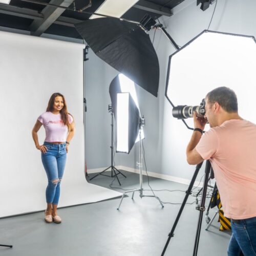
Welcome back to our blog! If you’re a returning reader, you might remember our popular post from 2017 about the perfect wall color for a photo studio. This post not only resonated with many, reaching a whopping 1.5 million views, but it also guided many photographers through the intricate process of setting up their studios. Now, six years down the line, I find it timely to revisit and expand on this post. As someone who has worked in this studio for years, I’ll be sharing my in-depth experience on selecting the perfect photography studio wall paint color.

Product Photographer: Allow me to introduce myself
I’m a product and advertising photographer with nearly 25 years of experience in the field. I’m proud to operate three studios across the United States, allowing me to explore a diverse range of products – from beauty and cosmetics to fashion, technology, medical devices, retail products, and everything in between. Over the years, I’ve had the privilege of working on photo and video advertising campaigns as a brand and beauty product photographer for world-famous brands. My work has not only been internationally published but has also been recognized and celebrated in top outlets around the world. Whether I’m capturing a lipstick tube or a high-tech gadget, my mission is to transform every product into a work of art, telling its unique story through my lens. You can check my portfolio here.
The Quest for an Ideal Photography Studio
Back in 2017, we embarked on a journey to establish our product photography studio. Little did we know then that this journey was going to be a rollercoaster ride, filled with challenges and excitement. Every day since the studio’s launch has been brimming with life and creativity.
However, let’s rewind to the beginning. Finding the perfect location for a photo studio was far from a walk in the park. As many photographers would know, a photography studio needs to meet certain specific requirements. On top of that, location plays a critical role. After much searching, our patience paid off when we stumbled upon a beautiful penthouse in New Jersey that was everything we were looking for.
Sifting Through Shades: Choosing the Photography Paint
Once we had the location locked down, the next step was deciding on the wall color for the studio. The choices were essentially white or a shade of gray, with each color having its pros and cons.
For our paint selection, we turned to the Benjamin Moore store in New Jersey, known for its vast and vibrant range. We shortlisted three shades of gray – 1616, 1615, and 1614. But, as any interior designer would know, the real test of a paint is not on the sample card, but on the wall it is intended for.
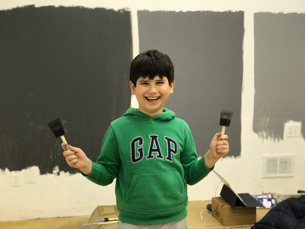
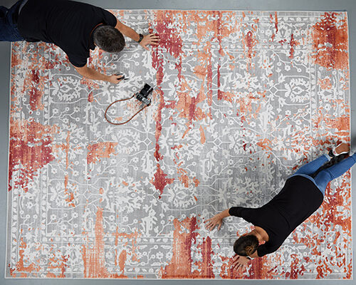
One sunny afternoon, my son Aydin and I decided to head to the studio for a little painting experiment. We painted three 4x5ft rectangles on a part of the wall that was equally lit by natural light from the window and the office lights. This way, we could observe the shades in different light sources, as gray tends to vary in shade under different lighting conditions.
As we waited for the paint to dry, we stumbled upon a hidden treasure – a closet full of toys left by the previous occupants. The discovery made our waiting time exciting, with Monopoly becoming our game of choice as we patiently waited for the paint to dry.
The Verdict: Our Photography Studio Wall Color Choice
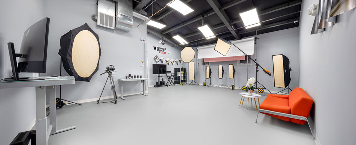
Once the paint dried, we had a clear winner. Colors 1616 and 1615, though beautiful, turned out to be quite dark for a space intended for hours of creative activity. Shade 1614 seemed almost perfect, but we thought it could be slightly lighter. After painting the entire wall with 1614, we realized that it appeared darker than it did on the small sample patch. So, we decided to explore a lighter option and finally landed on Benjamin Moore 2121-40 (Silver Half Dollar).
After years of working in this environment, I can safely say that this color choice was a winner. It is almost identical to middle grey, and it adds a subtly cool cast to the colors, enhancing the visual appeal of the images.
Delving Deeper: Why Gray is the Perfect Choice for Photography Studio Wall Paint
One crucial factor to keep in mind when selecting photography studio wall paint color is its potential impact on your photos. Colors other than gray and white could cast undesirable hues on your images. Gray and white, however, are safe bets. White walls can act as a reflector in the studio, while shades of gray can absorb some of the light, allowing you to have better control over the lighting during shoots.
In my experience as a product photographer, I prefer the control that gray walls provide. However, I do understand that portrait photographers might prefer white walls due to their ability to reflect light and minimize shadows.
Still, the choice of wall color should also factor in the size of your studio and the number of light sources you use. For instance, in a smaller studio, grayish shades can help control light reflection, preventing it from bouncing around too much. In contrast, white might be a more fitting choice in a larger studio.
The Final Touches: A Matter of Finish and More
Choosing the right finish for your photography studio paint is another vital aspect. I would recommend going for a matte finish over gloss, as glossy surfaces can cause bright light reflections and scatter light throughout the studio.
In line with the principles of light control, we’re also planning to paint our ceiling matte black. This color choice can absorb light, reducing reflections when shooting reflective objects.
As for the flooring, we opted for a gray concrete finish. Carpeting, though seemingly comfortable, can be a hassle in a photography studio, making the movement of stands tricky and getting dirty quickly, especially during food or splash photography shoots.
Wrapping It Up
In conclusion, the quest for the perfect wall color for your photography studio is about much more than aesthetics. It’s about understanding how different colors and finishes can impact your photographic output and influence your daily workflow. The right shade can transform your studio from just another workspace to an essential tool in your creative process.
So, here’s to you finding the perfect blend for your photography studio wall paint! Always remember, every color tells a story. Make sure you choose one that tells yours the best.


Comments (31)
Looks Amazing! Could you tell me what types of lights are in the boxes?
My Son’s name is also Aiden!
Take care
Hi,
Which lights do you mean? The strobes that we use? Or LED ambient lighting of studio?
Hello could I email you I’m setting up s studio and want a list of all the products you used it looks beautiful
What color was floor
It’s Gray and concrete
What LED lights did you use? I am redoing my studio and struggling with kelvin temperature. Your studio looks GREAT!
Great Job, looks awesome. Nice and clean. What kind of backdrop are you using? ie vinyl, paper. It looks really rugged.
Best wishes in your new place
Thanks. I am using 140” wide paper background from Savage. Purchased on bhphotovideo.com
It’s very easy to install and can be easily cut when you need fresh paper.
We painted floor darker grey. No light bounce and easy to clean
For ambient lighting we have 5600k LED lights.
For videos I use LED lights for aputure. RGB
For photography I use strobes 5600k.
Would be better if you ask your questions here, I will answer them so everyone can benefit. Thanks
Sir, you have the best studio in this area. Wish I could learn something from you.
What made you change from 1615 to half silver dollar?
Now I really i get clear view to change my studio wall colour… Thanks
Seenu
Chennai, INDIA
Hi,
Could you tell me who is the manufacturer of the led ambient lighting (5600k LED lights) on the ceiling?
Thanks!
Dennis
I get pleasure from, result in I found just what I used to be taking a look for. You have ended my four day lengthy hunt! God Bless you man. Have a great day. Bye
It does look good. The reason I found your post in my reason is that I am looking for a grey that will work for shooting portraits.
I shoot the portrait with the grey bg, and in post, blend a new, previously shot bg with the portrait in Photoshop using the blend mode of “overlay”.
Since “overlay” works perfectly with a neutral grey, it appears that I shot with a completely different bg, not grey.
Thanks for the help.
Nice work space.
I’m truly jealous.
Hi Mike, thanks for reading my blogs. To get a gray background the easiest way is to position the model about 10ft (2 meters) away from the white background and shoot the model from 5 fts..
Also, keep the lights away from the background and point them to model. Hope this helps
I hope that you won’t stop writing about it
regards for this rare information! .
You make it entertaining and you still take care of to keep it sensible. I can’t wait to read far more from you. This is really a tremendous site.
Ok this is a dumb question:
I’m converting a spare bedroom/office in my house into a YouTube studio. I want the background to be a gray (darker color). What is the finish you recommend? Like in terms of gloss? Semi gloss? Matte? Etc. will be using a 3 point lighting setup (small room but it’ll be good).
I definitely would not recommend using any glossy surfaces. Matte is the perfect way to go! You can use light gray as the color. This will help to prevent any unnecessary reflections and is also a nice color for the background.
It’s really informative and helped me a lot. Am planning to build a photo studio in the space of 14ft(W) x 60ft(D) x 12ft(H). It still in the planning stage. Can you suggest anything to focus on?
It really depends on what type of photography you are focusing on. It’s very different from one type to another. But I can tell that it will be uncomfortable to work in such a long studio since the width is less than 25ft. You have to count the width of the background and add 6ft to each side for lights.
There’s definately a great deal to know about this topic. I love all the points you have made.
Valuable information. Lucky me I found your site by accident, and I am shocked why this accident didn’t happened earlier! I bookmarked it.
wow, awesome blog.Really thank you! Awesome.
Hey my friend! Just subscribed! Thanks for this video. Can you send me a link to the white rectangular light panels you have on the ceiling? Would love to get some. Thank you so much for your quick response my friend.
Write more, thats all I have to say. Literally, it seems as though you relied on the video to make your point. You clearly know what youre talking about, why waste your intelligence on just posting videos to your weblog when you could be giving us something informative to read?
whoah this weblog is wonderful i like studying your posts. Stay up the good work! You realize, many individuals are searching round for this info, you could aid them greatly.